Helpful Hints on Planning and Preparing for the Design and Print of Company Stationery
Market Overview and Stationery Print Buying
Over the past decade the web has created a vastly competitive arena for the print industry. Pricing has become more transparent and print buying is now accessible and common place within small business and large corporations.
Advancements in technology, machinery and the scale of bulk printing have made a large contribution. Digital print has evolved in quality and accuracy and reduces many of the processes involved in traditional Litho printing. This set up also creates an effective and viable solution for short print runs which would have previously been cost-inhibitive.
For the consumer this competition and vast reduction in cost is a great advantage and means that a company of any size can now produce a set of high quality corporate stationery on a very modest budget.
Do I Still Need Printed Stationery in an Online World?
Building your brand, recognition and establishing trust is an ongoing process and one that needs support from both online and printed media. Electronic documents have indeed become part of daily business transactions but they often form part of the ‘After Sales’ communication.
Meeting face to face to seal an important contract or leave a lasting impression is where corporate stationery still plays a significant role. Presenting a consistent brand image on quality introductory materials reflects the attributes of your service and displays an investment that ultimately helps to build trust.
Leaving your client something tangible, tactile and retainable after an important meeting keeps your presence active. In short corporate stationery is working hard for you long after pcs, tablets and phones are off or out of sight.
Stationery Format and Design Considerations
A quirky idea, format or size can often arise in the concept of conceiving a range of stationery with the aim to achieve attention and recognition. If designed and developed properly there is no reason why individual ideas can’t make for impacting stationery with a bold and fresh approach. A poorly executed ‘idea’ can however be over complex, cluttered and expensive to produce. If in doubt it is often far better to take a clean disciplined approach and adopt an industry standard size.
If you are thinking outside of the box however do consider that options such as size, finishing, bespoke tooling and cutting shapes can all affect the final print cost. Most stationery is printed in large batches/runs on sheets of standard size stock. In order to keep costs low your job will normally join many others within this batch and be completed as one run. Standard sizes (A4 just for example) will all be able to be divided out of a standard sheet in order to complete a batch. If you design stationery outside of a standard size it may require a separate run or be delayed till it can be included with something suitable. Overall non-standard sizes will likely to be subject to additional costs.
With further regard to the format and sizing also consider the intended final use of the stationery. For example if you are looking for your business card to be retained by your client make sure it is not oversized or will fit in a wallet or holder easily. Alternative formats such as using squares over a traditional rectangle shape can be effective or relate well to your brand logo. Make sure though that the reduced overall area is adequate for your content. Also consider that being a tangible object perceptions are made from stationery. What you may consider a creative direction in using a square others may infer that you were looking to reduce costs by using less material.
Stationery Printing Colour Systems
Many years ago it was often cheaper to print stationery in 1 or 2 colours chosen from the Pantone system, printing in full colour was always a more expensive option. Today the reverse is mostly the case. As stated previously high quantity print runs now dominate that feature many different jobs in the same format being printed together, saving on set up cost, stock and time. Therefore it’s worth considering using full colour in your design from the outset so you have the option to reproduce photographic imagery or complex blends of colour. This print process is known as
‘4-colour process’ printing or
CMYK. Put simply this means whatever colours you use in your design can be reproduced by inks mixed from percentages of just four colours: Cyan, Magenta, Yellow, Black (K=Key Plate).
If you are using solid colours in your brand it is a good starting point to begin with a Pantone number in mind as a bench mark. This number can later be converted to CYMK to make it suitable for 4-colour process printing. The conversion will be a very close match to the original Pantone swatch but in some cases there may be a very small shift in colour which to most would be acceptable. Printing stationery via 4-colour process is the most common method and the one we would suggest unless you have special requirements.
If you are require an exacting match you may be better discussing the use of a Pantone colour with the printer as an option instead. Pantone colours can be specified an addition to using 4-colour process. The job would just become 5, 6 colour etc. instead of 4. Pantone colours are chosen from swatches and mixed to an exact formula similar to paint chart systems from a trade store. Jobs featuring Pantone colours are likely to have to be run separately on the press so the cost all round is likely to increase. Another more cost effective option is maybe to consider the use of
digital print to obtain a close Pantone match.
options such as size, finishing, bespoke tooling and cutting shapes can all affect the final print cost.
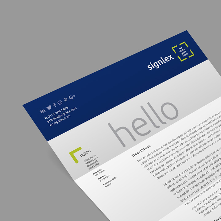
Company Letterhead – Helpful Hints and Planning for Design and Print
Planning your Letterhead Space and Content
Detail your required text content, keep things simple and uncluttered but make sure to include any legal requirements such as statements, company registration or VAT numbers. If you are required to display association or certified logos that support your activities formatting using a unified colour such as black, grey or some form of tint is a good option. This will help them integrate into your design layout while still allowing your brand to take preference.
Consider the
fold points of the letterhead (typically 2 folds at
99 mm intervals for DL size envelopes) and how they may impact on your space and content. If you are using window envelopes make sure to allow for alignment of address content.
Look to create a guide template for formatting your actual letter content that will overprint internally. This should work in harmony with your brand. If your brand logo fonts are not available on your system adopt something of similar and suitable style as opposed to defaulting to Arial or Times. Consider opening the letter content with a large short statement or greeting. This can help create some focus and break up the formalities and constant scale of the body text.
It is worth considering that a double side letterhead can create more visual impact. The back can be used for an area of solid colour, large elements from your brand or further information on services or products. The cost for double sided printing is now marginal and can be an effective way of making your letterhead communicate harder for you.
Adopting a watermark could also be an option. These can take the form of a large element from your brand or motif to bring some scale to the document and in contrast to the body text. Watermarks are best reserved for single sided designs and are typically printed at around 5% strength.
If you will be using your existing company logo make sure any artwork you provide is suitable for print. Ideally an EPS or a Tiff or Jpeg of 300 dpi resolution.
Choosing Letterhead Paper Stock
Using quality stock is key especially if the material is to support a presentation or is passed during meetings. Flimsy lightweight stock can reflect how you view or value your own business and can be detrimental to how you are perceived by others. Low grade stock will also reproduce colour poorly and create bleed so white areas of text may fill in and lose their crispness and legibility.
Request some free samples from your chosen printer featuring of a range of papers. They should also include some pre-printed examples so you can see how colour performs on the stock and get an idea from other people’s designs to how yours may reproduce. ‘Uncoated’ papers are usually a better option for letterheads as they will need to be over printed and maybe signed. Uncoated is more absorbent that coated paper and solid colour may appear flatter and a little darker at times. Overall this type of paper should be the best all round option for the job.
Typical
paper weight/thickness (measured in gsm) for letterheads is between 100-120 gsm. We would personally recommend
120 gsm where possible it has a more quality feel. As a rule or for direct comparison laser printer paper will typical be 80-90 gsm.
If your letterhead design is double-sided or has large areas of colour on the reverse you will also require a heavier paper stock to avoid ‘show through’ to the other side.
As you will overprint your letter onto a pre-printed letterhead using your internal printer (laser, inkjet etc.) it is worth testing this process on some of the paper samples you have received in particular a sample that you are likely to be using. Some weights and stock can cause jams so it’s best to test a few copies on your printer before ordering.
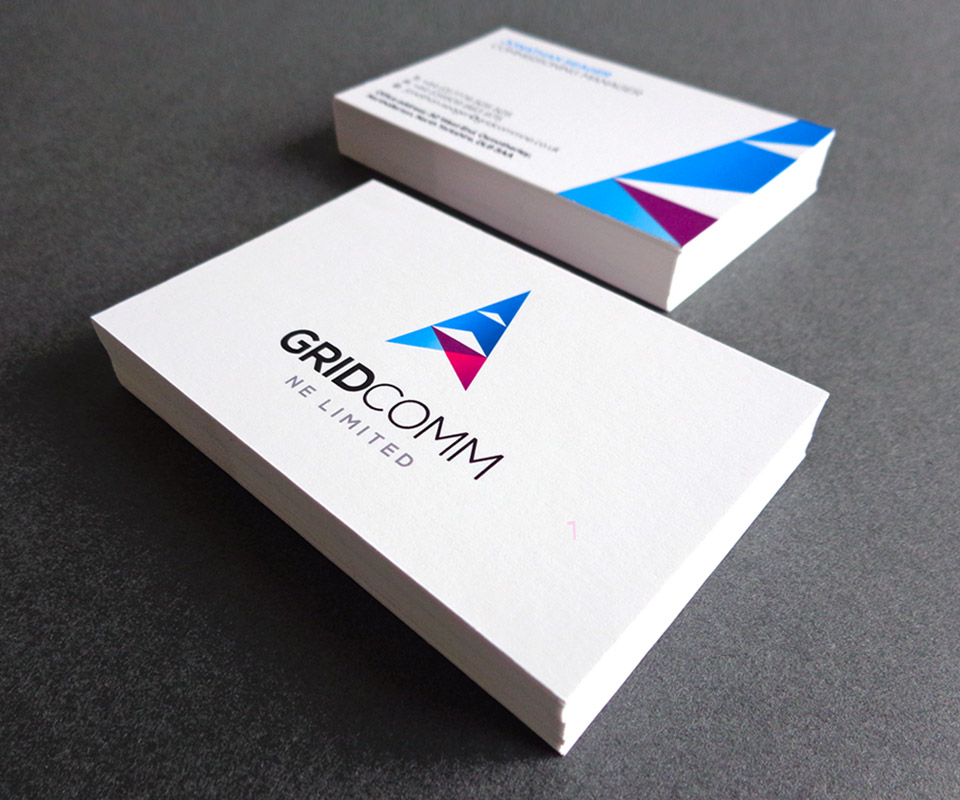
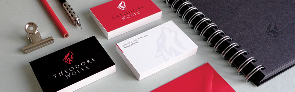
Business Cards – Helpful Hints and Planning for Design and Print
Planning Business Card Content, Design and Layout Considerations
As with letterhead printing recent reductions in cost have brought options to the humble business card that would have previously been too expensive to consider. Business cards are generally now printed in large batch runs using a 4-colour process system (see letterhead section for further info). Take advantage of this feature and use full colour over restricting the design to one or two. Remember using this system you can also include photographic imagery where required.
Consider a double-side card. This has become quite a common format and the additional cost is very marginal. As a business card offers quite a restricted area the option for spreading content over both sides creates flexibility and can naturally divide between brand identity (front) and contact details (reverse). This division creates a much cleaner less cluttered space and makes it easier to achieve a balanced layout. For impact and contrast look at using a solid colour on one side of the card or some brand elements at scale.
Content wise keep things simple as even on double-sided cards space is at a premium. If it’s not essential to your operations omit your address and leave that to correspondence material only. Include your name, title, landline, mobile, web, email address as well and social media links if you have them, customers have their own preference of contact so offering a range is wise.
If you will be using your existing company logo make sure any artwork you provide is suitable for print. Ideally an EPS or a Tiff or Jpeg of 300 dpi resolution.
Including standard certification or third party logos that your business maybe associated to isn’t advised within such a small area unless it’s fundamental to your business activities. These types of logo are often very disparate in groups and work against your brand environment.
Business Card Sizes and Formats
Typically
standard business card size is 85mm (w) x 55mm (h). Depending on your brand and content a portrait type layout may also work for you and is always worth considering. Extra wide or oversized cards are available but review how easy these formats are to retain in standard wallets or holders.
A folded card could be a good option if you want to include some service information or showcase a product. They can act like a mini-brochure of 4 sides and have the advantage of being standard business card size (85mm x 55mm) but opening out to 170mm. Square business cards (typically 55mm x 55mm) can be an interesting alternative and may form part of a consistent set if your other brand literature (brochures etc.) are adopting a square format. Square cards offer a reduced overall layout area, assess whether this is adequate for your desired content.
Business Card Stock Weight and Samples
Once again ‘quality is king’ here. Remember the purpose of the card is to be retained, flimsy lightweight stock has the appeal of junk mail and is therefore likely to meet the same end. Request a range of samples from your chosen printer that include printed examples so you can see how the board responds to colour. The minimum gsm (card weight/thickness) for business cards is around 300 gsm but we would recommend at least
350 – 400 gsm as it has much more of a quality feel to it and improved rigidity.
A Guide to Business Card Papers and Performance
Coated: If you are looking to retain strong bright solid colours on a clean white surface choosing a ‘coated’ paper stock for your card maybe the best bet. Something like a ‘silk’ stock will perform well here.
Uncoated: This stock will absorb more ink and can create a flatter duller appearance to colour. This maybe the look for you but is also something to watch if colour accuracy or brightness is key to your design.
Recycled: This material has a slightly rougher texture and can contain small particles/flecks. It may also have off-white appearance. Like uncoated papers it also absorbs and creates flatter areas of colour. Recycled paper could be a good choice for a retro type brand where an aged appearance or slight colour shifts would have been indicative of the age.
Many other papers types are available that include hammered, tear/waterproof, textured or weave finishes. Off-whites or creams can create a certain look but consider that base colours other than white can create a slight shift in colour. If in doubt always refer to a printed sample. If you are trying to achieve a particular feel it may be worth considering having a test proof printed on your intended stock to assess the results.
Business Card Print Finishing
Consider any ‘print finishing’ you may require for your business cards such as lamination. This shouldn’t be overlooked as it can help create a tactile/quality feel, act as a seal for large solid colour areas and prevent easy marking and scratches on dark areas. Lamination is typically available in matt or gloss finishes. Matt is generally more commonly used and provides a nice silky feel to the card.
Compliments Slips – Helpful hints and planning for design and print
Detailed information in the letterhead section regarding stock choice and use of colour will also apply here. That is because compliment slips are generally printed on the same type of paper stock as letterheads and need to be easy to write on. Therefore ‘uncoated’ papers of around
120 gsm would remain a good choice. As with letterheads, compliments slips will also typically be printed using 4-colour process printing (see letterhead area for further detail).
Industry
standard compliment slip size is traditionally 210 mm x 99 mm. The height being a third of A4 (297 mm) and like a folded A4 letter it is designed to fit a DL sized envelope.
There should be an obvious family connection between the design of letterhead and the compliments slip. The layout should be clean and balanced. Legal statements or third party association logos are probably best kept to your letterhead if they have to be included. Weigh up the option of a double sided compliments slip, the front could feature a bold logo or brand colour and a white reverse side could be reserved for content. Provide a range of points of contact including social media if you have set it up.
If you will be using your existing company logo make sure any artwork you provide is suitable for print. Ideally an EPS or a Tiff or Jpeg of 300 dpi resolution.